Vibrations
5 FFTs and spectrograms
Frequency domain graphs
Frequency-domain graphs– also called spectrum plots and Fast Fourier transform graphs (FFT graphs for short)- show which frequencies are present in a vibration during a certain period of time. Spectrum plots are particularly useful for representing sounds, because frequency plays such a large role in hearing,
Frequency domain graphs show much of each frequency is present in a sample. Frequency is plotted along the x-axis and amplitude is plotted along the y-axis. FFTs often look like a series of mountain peaks. The horizontal location of peaks indications which frequencies are strongly present in the sound. The valleys show which frequencies are absent.
The math that transforms a time domain graph into a frequency domain graph erases all information about when the sounds occurred within the sample. All of the sounds shown on an FFT occurred at some point during the sample, but it’s impossible to tell when which one occurred. (If you want to find out which sounds occurred when, look at a time-domain graph). Making a meaningful FFT requires choosing your sample carefully- for simplicity, the sound you analyze with an FFT should remain reasonably constant throughout the entire sample.
Frequency domain graphs of some common sounds
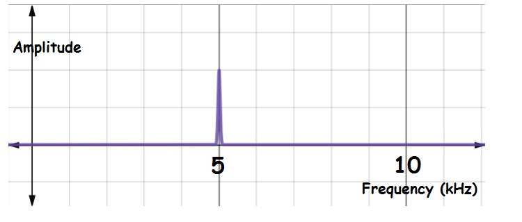
A pure tone consists of just a single frequency- all other frequencies are absent. As a result, the FFT of a pure tone is a single vertical “spike” or “peak.” The location of the spike along the horizontal (frequency) axis indicates the frequency. The height of the spike gives the amplitude. The figure below shows the FFT of a pure tone with frequency 5,000 Hz:
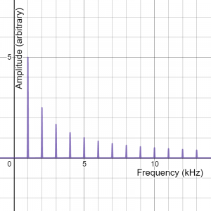
FFTs of complex vibrations have multiple peaks- one for each frequency present in the vibration. Low frequency peaks are shown at the left end of the graph. The left-most peak represents the fundamental. Other peaks indicate overtones. The height of each peak indicates how much of each frequency is present in the vibration. Frequency components with large amplitudes have tall peaks. Frequencies with shorter peaks have smaller amplitudes. While the fundamental is often the tallest peak, it does not have to be. Some sounds are made up of a weak fundamental and prominent overtones. Here’s the FFT of a complex sound with a prominent fundamental at 1 kHz, an overtone at 2 kHz, an even weaker overtone at 3 kHz, and so on.
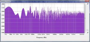
Frequency plots for non-periodic vibrations don’t have distinct peaks. Here’s an example:
Stop to think
One of the figures above (“Frequency domain plot of a complex vibration with a fundamental frequency of 1 kHz”) shows peaks at many different frequencies. Which of the frequencies on the graph occurred first? Explain.
Time domain vs. frequency domain
Time domain graphs are useful for showing how vibrations change with time, but not very useful for showing spectral content. Frequency domain graphs show spectral content, but contain no information about how vibrations change over time. A complete description of a changing vibration requires both time-domain and frequency-domain graphs. Later in the book, you will see spectrograms- a type of graph that is mixture of time- and frequency-domain graphs.
Creating FFTs
You will probably never have to do the math that turns time domain graphs into frequency domain graphs, but you may have to select settings on a computer program that generates FFTs, so it’s important to recognize some of the limitations of the math.
First, choose a sample of the time-domain graph where the vibration is not changing much. Make the sample as long as possible. (There’s obviously a trade-off here: the longer the sample you choose, the more likely it is that the vibration will change during your selection). Second, choose the best time window. Time window is a parameter used in the FFT calculation. Most computer programs have a default setting for time window that the user can change. Longer time windows generally give more detailed FFT graphs. The time window cannot be longer than the sample. Time window is also limited by the sampling rate of the recording.
Stop to think answer
This FFT probably represents a single complex tone played for the entire sample. If so, all frequencies are happening simultaneously. But there are other possibilities. For instance, this FFT could be from a series of pure tones played one at a time in ascending order, or from a series of pure tones played in descending order. You just can’t tell. FFTs only show which frequencies are present in a sound sample- FFTs do not show when those sounds occur. That’s why most FFTs are made from a sample of sound that is constant throughout.
Spectrograms
A spectrogram is a hybrid between an FFT and a time domain graph- it shows how the spectral content of the vibration changes over time. Spectrograms are especially useful for analyzing quasi-periodic vibrations (like those in music and human speech).
A spectrogram is usually drawn in two dimensions, with time along the horizontal axis and frequency on the vertical axis. Amplitude is also included, using color or grayscale. If you think of FFTs as snapshots, a spectrogram is a movie- a series of FFTs displayed in the order they occurred. Each narrow strip of a spectrogram is essentially an FFT turned sideways, with color bands instead of peaks.
Spectrograms are especially useful for examining human speech and music. The figure below shows how spectrograms can be used to spot characteristic sounds in speech. Notice that the spectrogram is especially good for identifying differences between different vowel sounds.
If you read music, you might find spectrograms intuitive. Western music notation reads from right to left in chronological order- so does a spectrogram. In music notation, notes are placed vertically according to pitch- higher pitcher toward the top of the page. Frequency and pitch are not exactly the same (as you’ll see next chapter), but they are closely related- the higher the frequency, the higher the pitch. The best way to catch the connection is to watch a few “not quite spectrogram” YouTube videos. Here are a few of my favorites:
- Bach’s Little Fugue in g minor (3:45 min YouTube) [1]
- Liszt’s Hungarian Rhapsody Nr. 2 (8:58 min YouTube) [2]
- a whimsical Classical Music Mashup (6:08 min YouTube) [3]
I call the YouTubes above “not quite” spectrograms because they only show the fundamental.
Music notation shows the fundamental of each melody note, but a spectrogram shows fundamentals and overtones. Here’s an example. Bach’s Passacaglia and Fugue in c minor (for pipe organ) starts with the organ playing a single melody line- no chords. The figure below shows the spectrogram of the first few bars of the piece, along with the music:
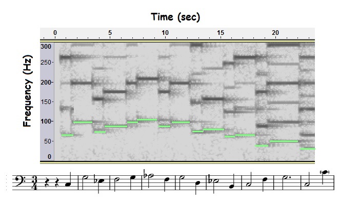
The bottom-most dashes on the spectrogram (highlighted in green) show the melody line- the fundamental of each pipe organ note. The dashes directly above a highlighted dash are the overtones.
Amplitude is not easy to show on a spectrogram- there’s no axis for amplitude. Some spectrograms (like the one for the Bach fugue above) use grayscale- darker lines indicate bigger amplitude. Some spectrograms use color. Others, called waterfall plots, are in three dimensions with amplitude on the third axis.
Time resolution vs. frequency resolution
Spectrograms would seem to be the best of both worlds, capturing both time and frequency information on the same graph. There must be a catch, right? Spectrograms involve compromise. Remember that a spectrogram is a series of FFTs “snapshots.” To make a spectrogram, a computer program splits the entire recording into short sections and an FFT is made for each section. If the recording is split into lots of short samples, the resulting spectrogram has great information about when each FFT occurred (good time resolution). However, each FFT will have imprecise frequency information (poor frequency resolution), since it’s based on a short sample. Cutting the recording into fewer, longer samples improves the frequency resolution (sharpens up the peaks on each FFT) but degrades the time resolution. The key to producing a useful spectrogram is finding the “sweet spot.”
Online resources
Play the Bird Song Hero Game. [4] Try to match the recordings of bird songs with their spectrograms. Basic game takes less than ten minutes. There’s an advanced level, if you’re thirsting for more.
Watch What is a Fourier Series? This youTube (8:24) that explains the connection between frequency domain graphs and time domain graphs by drawing circles. [5]
Watch Timbre. The youTube (2:05) shows spectrogams, real-time FFTs and time domain graphs as different musical instruments play the same note. The video uses Overtone Analyzer by Sygyt Software. [6]
Image credits
- Frequency domain graph for a simple harmonic oscillation with a frequency of 1000 Hz. Created by David Abbott using desmos.com.
- Frequency domain plot of a complex vibration with a fundamental frequency of 1 kHz and overtones at 2 kHz, 3 kHz, etc. Created by David Abbott using Desmos.com
- Frequency domain graph of non-periodic vibration (a.k.a. noise). Created by David Abbott using Audacity.
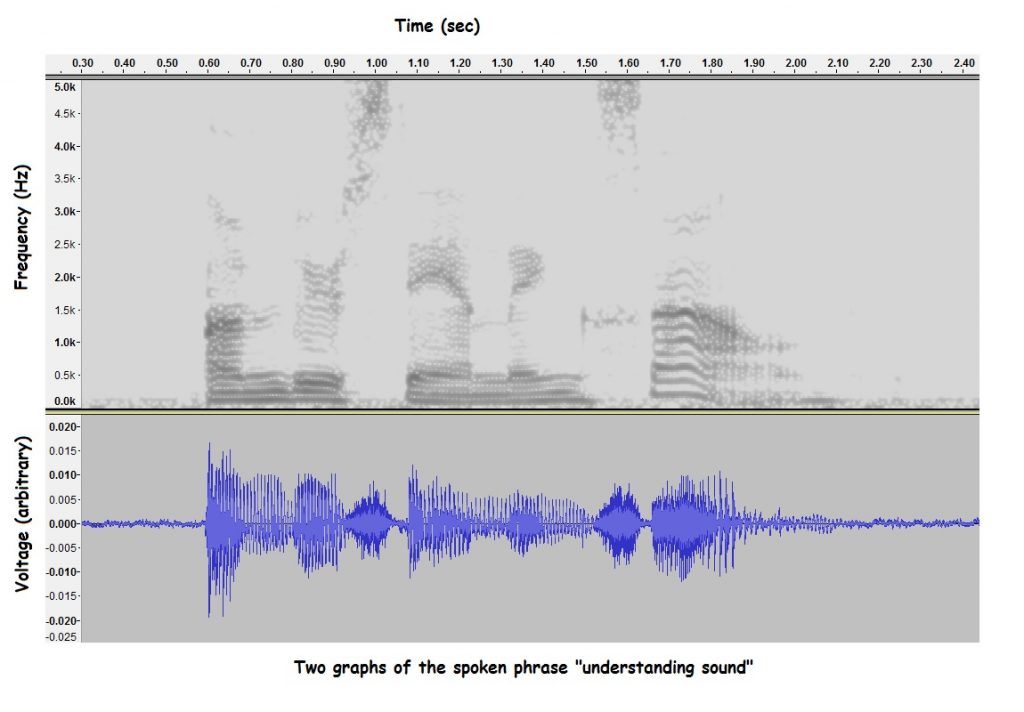
- Frequency and time domain graphs of the spoken phrase “understanding sound.” Created by David Abbott using Audacity.
- Opening to Bach’s Passacaglia in c minor (BWV 582). Created by David Abbott using Audacity.
- Malinowski, S. (2013, July 12). Bach "Little" Fugue in G minor, Organ. Retrieved from https://youtu.be/ddbxFi3-UO4. ↵
- Fillebrown, A. (2012, Oct.10). Liszt Hungarian Rhapsody 2. Retrieved from https://youtu.be/m6xWGVhZl1g ↵
- Woolard, G. (2016, Jan. 12). Classical Music Mashup. Retrieved from https://youtu.be/7OYkWSW7u4k. ↵
- Cornell Ornithology Lab (n.d.). Bird Song Hero. Retrieved from https://academy.allaboutbirds.org/features/birdsong/bird-song-hero-training. ↵
- Sandler, D. (2018, 10 Dec.). What is a Fourier Series? (Explained by drawing circles)- Smarter Every Day 205. Retrieved from https://youtu.be/ds0cmAV-Yek. ↵
- Constantinsen, B. (2014, 10 May). Timbre: Why different instruments playing the same note sound different. Retrieved from https://youtu.be/VRAXK4QKJ1Q. ↵
